Animated Explainer Video: 5 Styles With Examples
The five main animated explainer video styles (whiteboard, motion graphics, character, kinetic type, isometric) with example scenes and when each works best.
An animated explainer video is a short animated film, usually one to three minutes long, that makes one idea easy to understand. Most of them use one of five styles: whiteboard drawing, 2D motion graphics, character animation, kinetic typography or isometric animation. The right style depends on what you are explaining: a process, a product with numbers, a human story, a short punchy message or a system with many parts.
Below is each style with an example scene, what makes it work and when to choose it. The example scenes are illustrations written for this article, not descriptions of any company's real video, so you can borrow them freely.
What every good animated explainer has in common
Before the styles, the things that matter in all of them. A beautiful animation with a weak script still confuses people; a plain animation with a clear script works.
- One message. The viewer should be able to repeat it in a sentence afterwards.
- One idea per scene. When the voice moves on, the picture moves on.
- Picture and word arrive together. The image appears when the narrator mentions it, not before or long after.
- Clear sound. Viewers forgive simple pictures far more readily than muddy audio.
- A single next step at the end.
Style comes after all of that. If you have not written the script yet, start with our explainer video script template, then come back to choose how it should look.
1. Whiteboard animation
What it looks like: bold black drawings appear on a white background, one at a time, as the narrator speaks. Colour is used sparingly, often a single fill to pick out the important part. Some versions show a hand drawing; many simply let the lines appear.
Example scene (illustration): a video explaining how a heat pump warms a house. The narrator says, "It pulls warmth from the cold air outside," and a small box appears beside a house with three wavy arrows flowing into it. "Squeezes it until it's hot," and the box gets a squeeze mark and a red glow. "And sends it to your radiators," and a line runs from the box to a radiator inside. Three sentences, three drawings, one connected board.
Why it works: the viewer watches each idea arrive at the moment it is spoken, so eyes and ears are on the same thing. Plain drawings leave nothing to decode, which keeps attention on the idea. And because the board builds up, the final frame is a summary of everything said.
Best for: processes, cause and effect, "how does this work" and "why do we do it this way", lessons, training, and any topic with a sequence.
Watch out for: boards crammed with ten drawings, and long stretches where the narrator talks with nothing new appearing.
Our guide to what whiteboard animation is covers the style in depth, including how it is made by hand, in timeline tools and with AI.
2. 2D motion graphics
What it looks like: flat shapes, icons, charts and simple screens that slide, grow, morph and snap into place. Clean colours, often the brand's palette, and smooth movement. People, if they appear, are simple icons rather than characters.
Example scene (illustration): a budgeting app. A single coin drops onto the screen and splits into three, rolling into three jars: bills, spending, savings. The savings jar fills a little each time a new coin lands. Then the jars shrink into the corner of a phone outline, and a bar chart grows next to them as the narrator says, "and you can see at a glance where the month went."
Why it works: motion shows change. A number growing, money moving, one thing turning into another: these are hard to describe in words and easy to show with a shape that moves. The flat, tidy look also reads as modern and trustworthy, which suits software and finance.
Best for: software and apps, financial products, data, features with before-and-after numbers, homepage videos for tech products.
Watch out for: movement for its own sake. When every icon bounces, nothing stands out. Each animation should show something the words are saying.
3. Character animation
What it looks like: cartoon people (or animals) with faces, expressions and a small story. The viewer follows a character through a problem and out the other side.
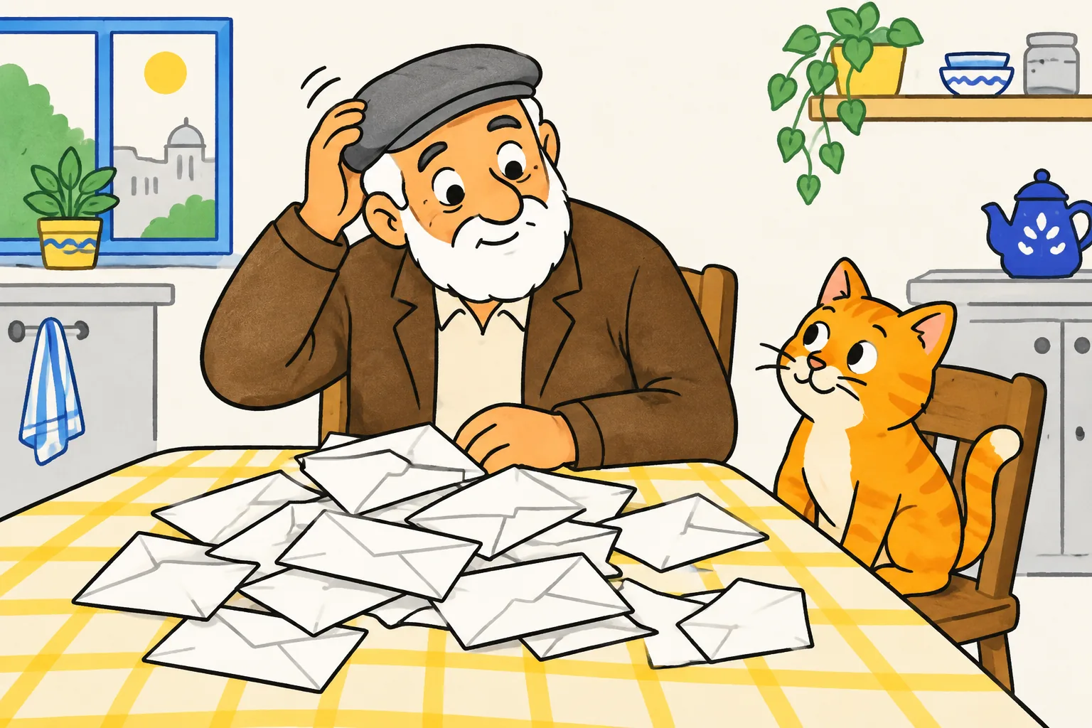
Example scene (illustration): an explainer for a service that sorts paperwork for older people. We meet a retired man at his kitchen table, scratching his head at a pile of letters while his cat watches. "Every week, the post brings something new to worry about." Cut to him handing the pile to a friendly helper. Cut again: a tidy folder, the man reading the paper with a cup of tea, the cat asleep on the empty chair.
Why it works: people remember stories and faces. When viewers see a character feel the same frustration they feel, they lean in. The before-and-after shape (worried, then relieved) carries the message without needing many words.
Best for: services, consumer products, public information, anything where the feeling matters as much as the facts, and audiences who are not specialists.
Watch out for: cost and time. Characters need designing, posing and animating in every scene, so this style usually takes the most work to make and the most work to change. A long story can also crowd out the actual explanation; keep the plot to two or three beats.
4. Kinetic typography
What it looks like: the words themselves are the animation. Key words and phrases appear in large type, timed to the voice, sliding, stacking, scaling and swapping as they are spoken. Often there are few or no pictures.
Example scene (illustration): a 30-second road-safety clip for social media. Black screen. "When you pass a cyclist" appears line by line, in time with the narrator. Then a single phrase fills the screen in bold: "give them room". It shrinks, and a short line underneath completes the thought. The final frame is the one rule, alone, held for three seconds.
Why it works: many people watch social video with the sound off, and kinetic type still works without audio. Big words give a strong rhythm and are good at making a short message stick.
Best for: short social videos, announcements, campaign messages, quotes, a slogan or rule people should remember, and intros or outros for longer videos.
Watch out for: explaining anything with parts. Text alone cannot show how a process works or what something looks like. Kinetic type also fails when it turns into a slideshow of full sentences; keep it to a few strong words at a time.
5. Isometric animation
What it looks like: a small world drawn at a fixed angle, so objects look three-dimensional but without perspective shrinking them. Buildings, machines, vehicles and tiny people sit on a tilted grid, and the camera glides over them.
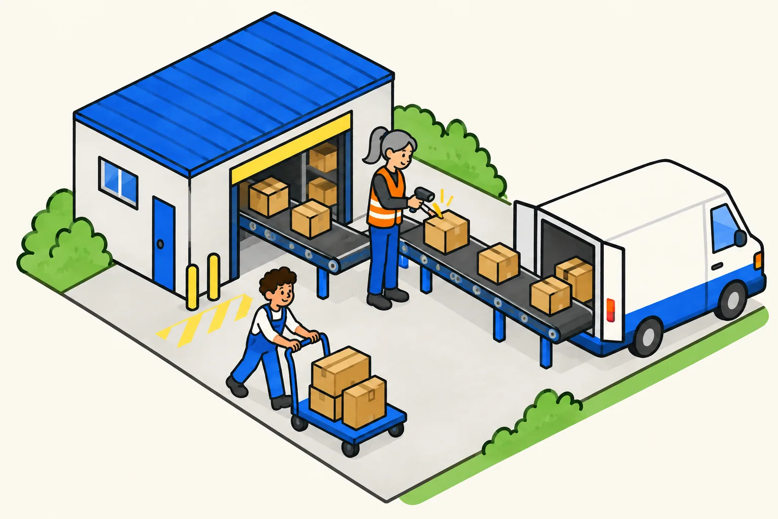
Example scene (illustration): a video explaining how an online order gets to your door. The camera starts above a tiny warehouse. A box rides a conveyor, gets scanned by a worker in an orange vest, slides into a van, and the camera follows the van along a road to a row of houses. Each stop is one sentence of narration.
Why it works: isometric views show many parts at once and how they connect, while keeping everything neat. Viewers can see the whole system and then zoom in to one part, which is hard to do with flat drawings.
Best for: logistics, supply chains, factories, cities, networks, infrastructure and any "how all the pieces fit together" explanation.
Watch out for: detail overload. A busy isometric scene is lovely to look at and hard to follow while listening. Show the whole map once, then focus on one part at a time.
How to choose the right style
Start from what the viewer needs to understand, not from the style you like best.
| If you need to explain... | Strong choice | Also works |
|---|---|---|
| A process or a reason ("how it works", "why") | Whiteboard | Isometric |
| A software product or app feature | 2D motion graphics | Whiteboard |
| Numbers, money or data changing | 2D motion graphics | Whiteboard |
| A service people need to trust | Character animation | Whiteboard |
| One short rule or message for social | Kinetic typography | Motion graphics |
| A system with many connected parts | Isometric | Whiteboard |
| A lesson or training topic | Whiteboard | Character animation |
Two practical questions narrow it further:
- How often will it change? If prices, steps or features change every few months, pick a style that is quick to remake. Simple drawn styles and AI-generated videos are far easier to update than custom character animation.
- What is the budget? Custom character and isometric work usually cost the most because every scene is designed. Our guide to explainer video costs compares the main routes.
You can also mix styles. A common pattern is a whiteboard or motion-graphics explainer that ends on a few seconds of kinetic type for the call to action.
Whiteboard style examples from KolaVid
KolaVid makes the first style on this list: it turns a prompt, a script, a document or a web link into a narrated whiteboard video, with each drawing appearing as the narrator says it and one idea on each board. The two frames below come from public sample videos.
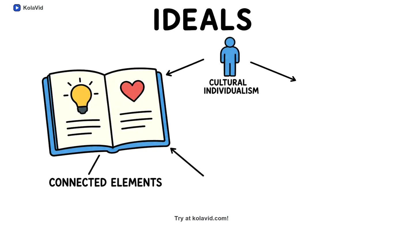
The first is from a summary of a research paper. Notice how the board names only what the narrator is saying, with plain drawings and arrows showing how the ideas connect.
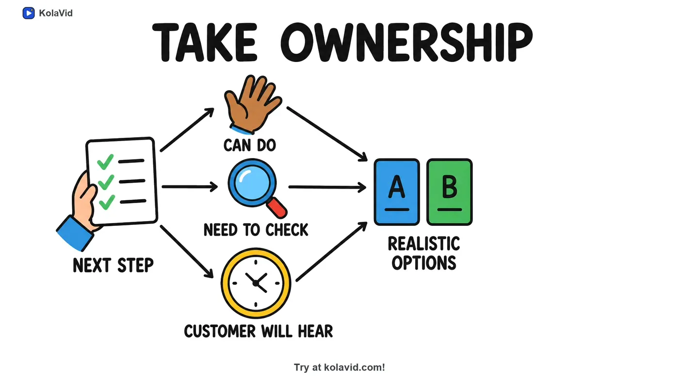
The second is from a staff training video on handling a customer complaint. One step of the procedure became one board, with each part drawn as it is mentioned.
The frame (Wide 16:9, Tall 9:16 or Square 1:1), the length, a female or male voice and the narration language are chosen before you start, and the video is usually ready in a minute or two. Free videos run up to 2 minutes. KolaVid does not make motion graphics, kinetic typography or isometric videos, and it has no editing timeline; for those styles, a dedicated animation tool or studio is the better fit. The whiteboard page has more samples, and our guide on how to make an explainer video covers the steps around the animation itself.
FAQ
What is the most effective style of animated explainer video?
There is no single best style. Whiteboard animation suits processes and reasons, motion graphics suit products and numbers, and character animation suits stories and services. The script matters more than the style: a clear one-message script works in any of them.
How long should an animated explainer video be?
Most are 60 to 90 seconds for a homepage or product page, and 30 to 60 seconds for social. Concept and lesson explainers can run 2 to 5 minutes when the topic has several connected parts.
What is the difference between 2D animation and motion graphics?
2D animation usually means characters and scenes drawn and animated frame by frame or with rigs. Motion graphics animate shapes, icons, text and charts rather than characters. Many explainers combine the two.
Can I make an animated explainer video without an animator?
Yes. Template-based animation tools let you assemble scenes yourself, and AI generators can turn a script or prompt into a finished video. The script is still your job, and it is the part that decides whether the video works.
Pick the style after the script
Write the one sentence your viewer should remember, then look at the table above and choose the style that shows it most simply. If a process, a reason or a lesson is what you need to explain, you can try the whiteboard style with a free KolaVid account, which includes enough credits for one 2-minute video, no card needed.